Brand Identity for UK Seed Paper

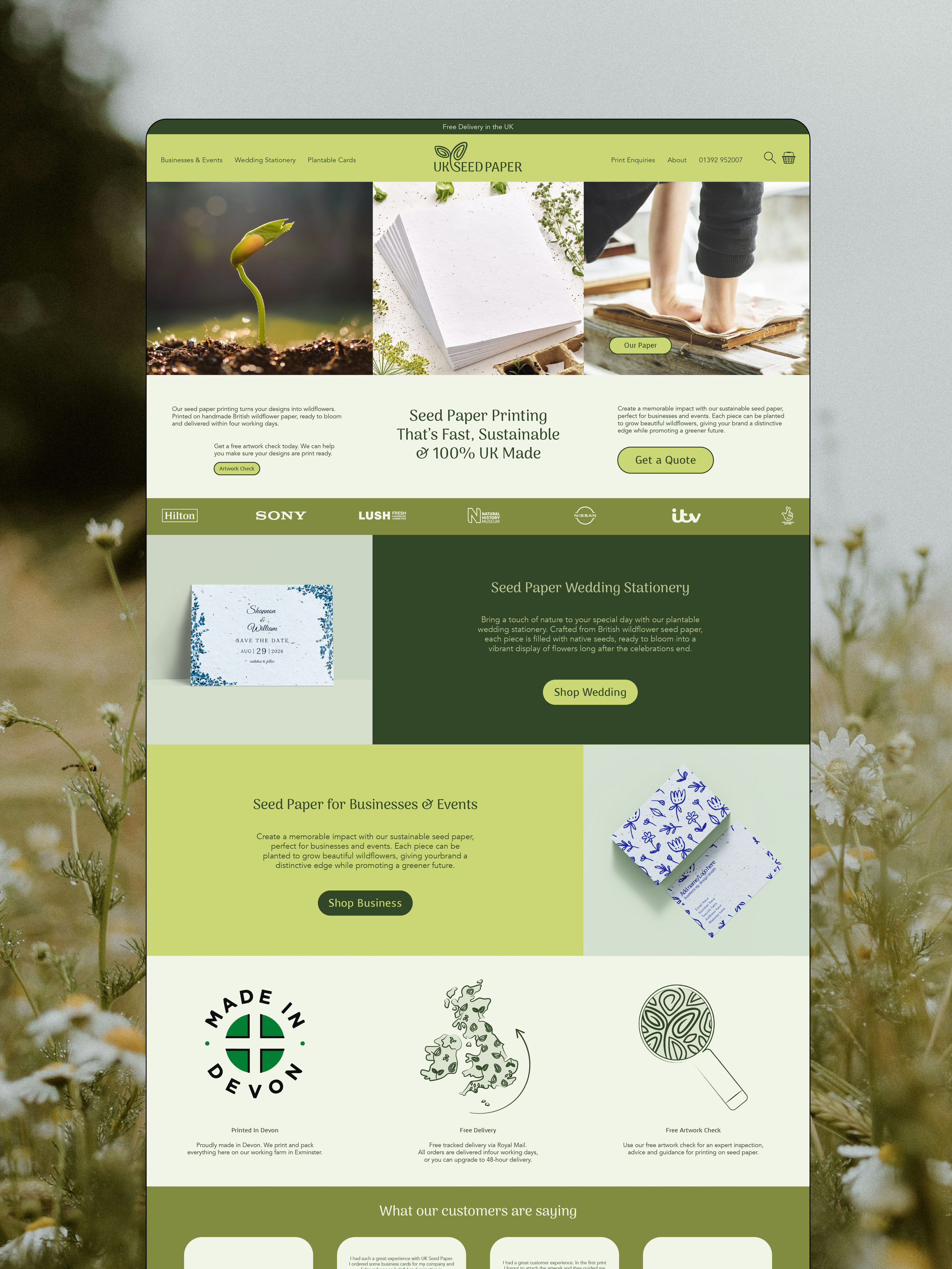
UK Seed Paper approached us with a logo that wasn’t accurately representing their business. The original design used a simple font and an icon resembling a water droplet rather than a seed, which led to confusion about its printing on handmade seed paper. It also felt rigid and disconnected from the product's natural, organic quality. With only one logo variation and no full brand name included, the brand lacked clarity and recognition.
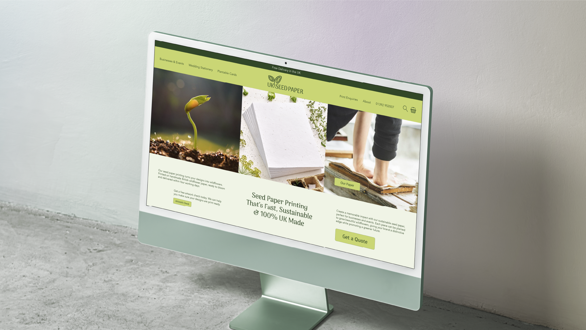
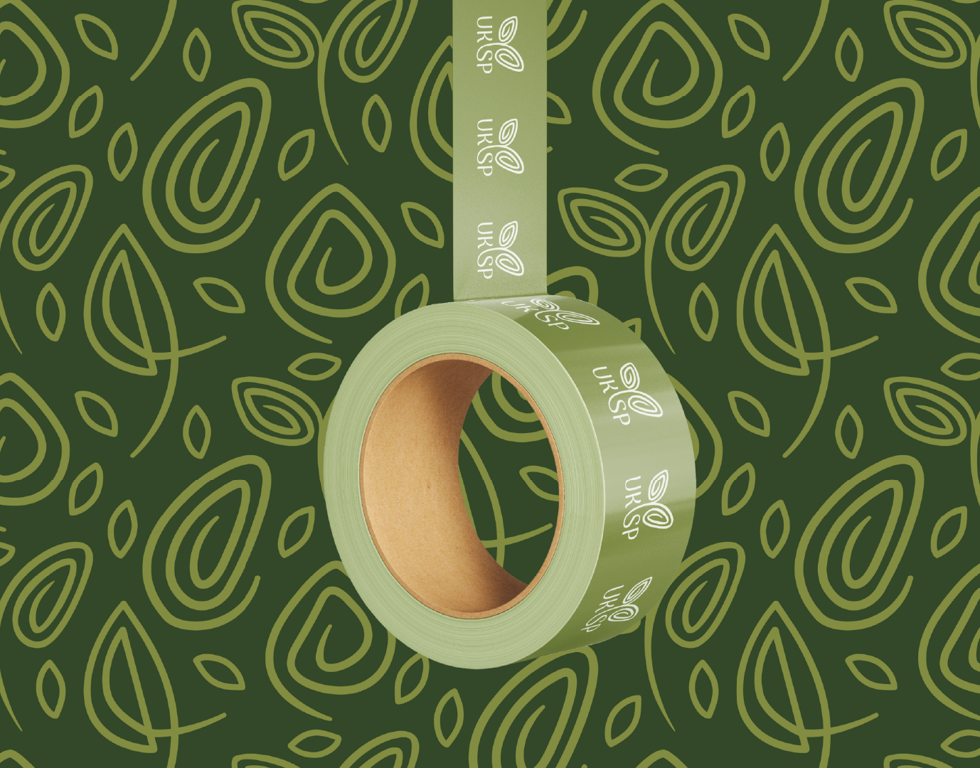
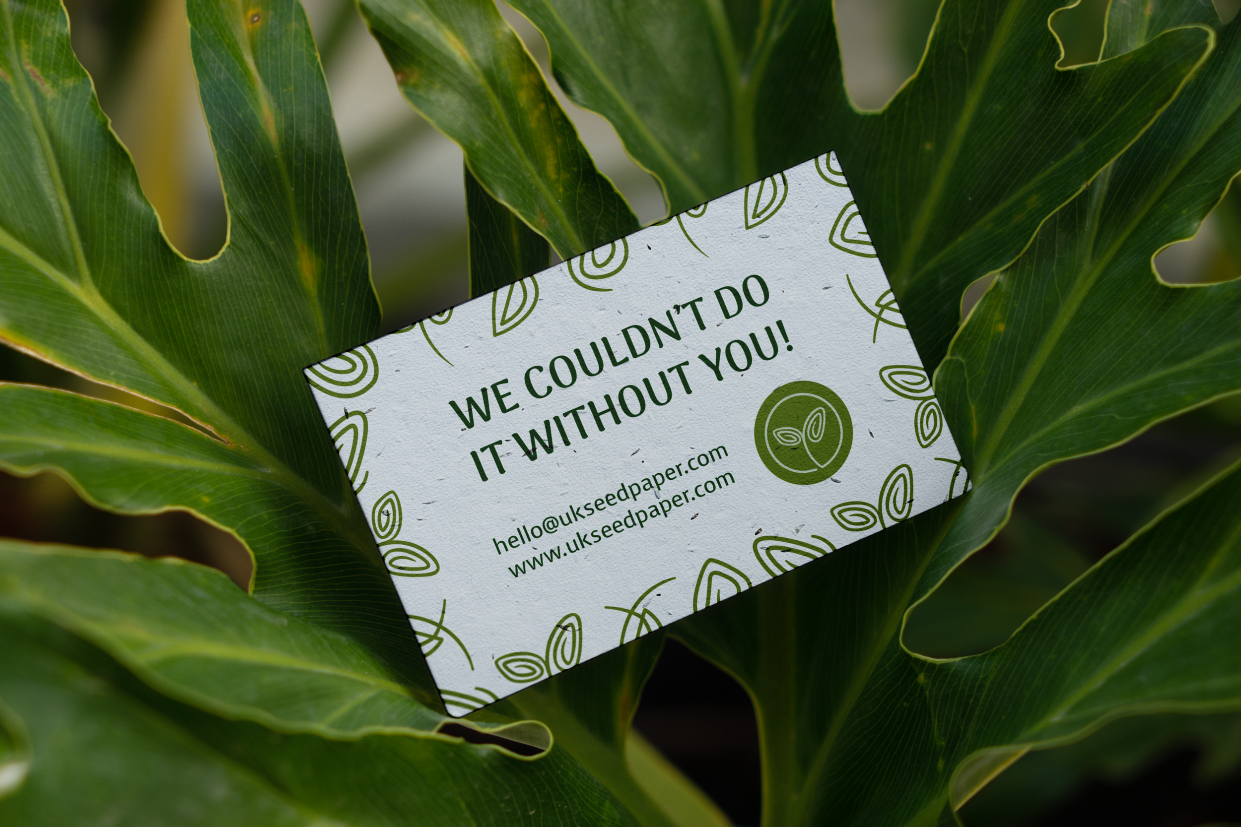
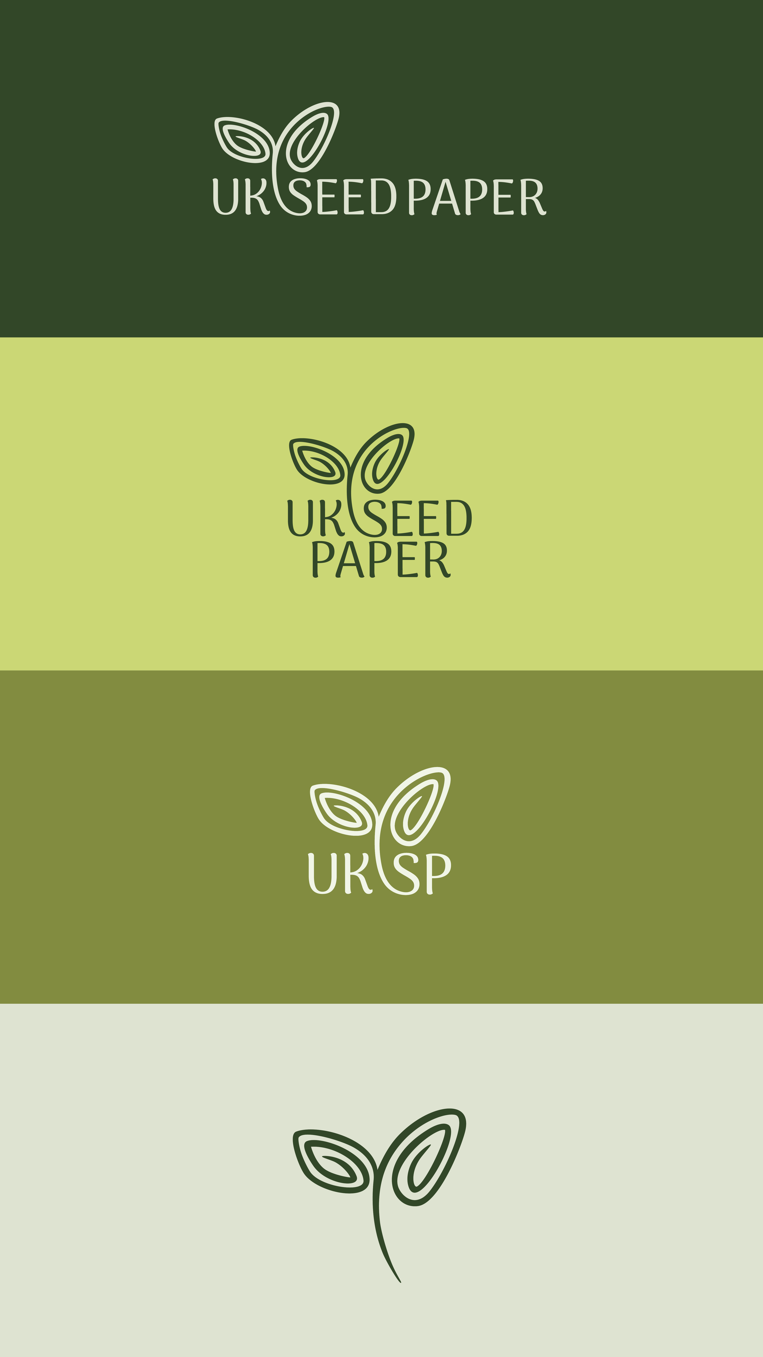
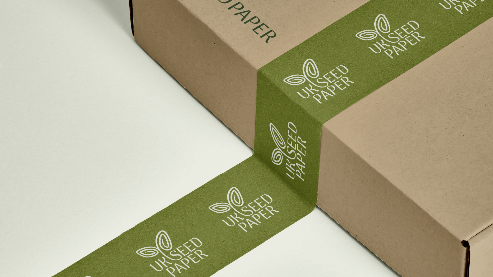
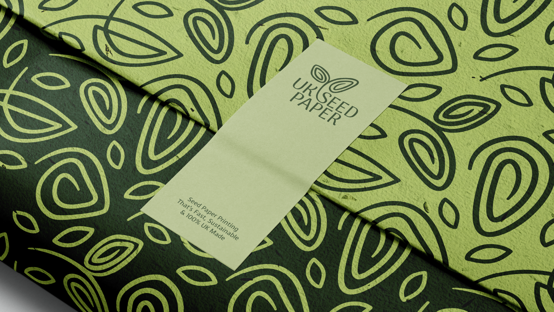
We created a new brand identity that reflects the handcrafted nature of UK Seed Paper. This included a complete logo suite with multiple variations, a typeface with natural weight shifts to echo the organic qualities of seed paper, a cohesive colour palette to strengthen recognition, and custom illustrations and patterns inspired by real seeds. The result is a consistent and recognisable brand that finally reflects who UK Seed Paper is and what they stand for.
Ready to Bring Your Brand to Life
Contact us to start your project or request a free consultation. We would love to hear your ideas and help you take your brand forward.
